Monday, July 26, 2010

July 26 2010 Learning 3D in GIS Mt St Helens


Mt Saint Helens 3D View


Mt Saint Helens Shade View

July 26 2010 OH CANADA and Lab 5


Lab 5 answers
1) 99 counties in Iowa
2) Fulton County 832094 persons
3) 39 cities within Washington State with population of 15,000
4) 3990.666895Miles of interstate
5) 871656 Acres
6) 522 zip codes
7) See Map
8) 5 Indian Reservations
Kitigan Zibi Indian
Doncaster Indian Reserve 17
Kahnawake Indian Reserve 14
Kahnawake Indian Reserve 16
Akwesasne Indian Reserve 15

Monday, July 19, 2010

July 19 Blog Using Data


Numbers what do they mean? why are they useful? Why does it matter? People ask these whenever they look at “the Numbers”
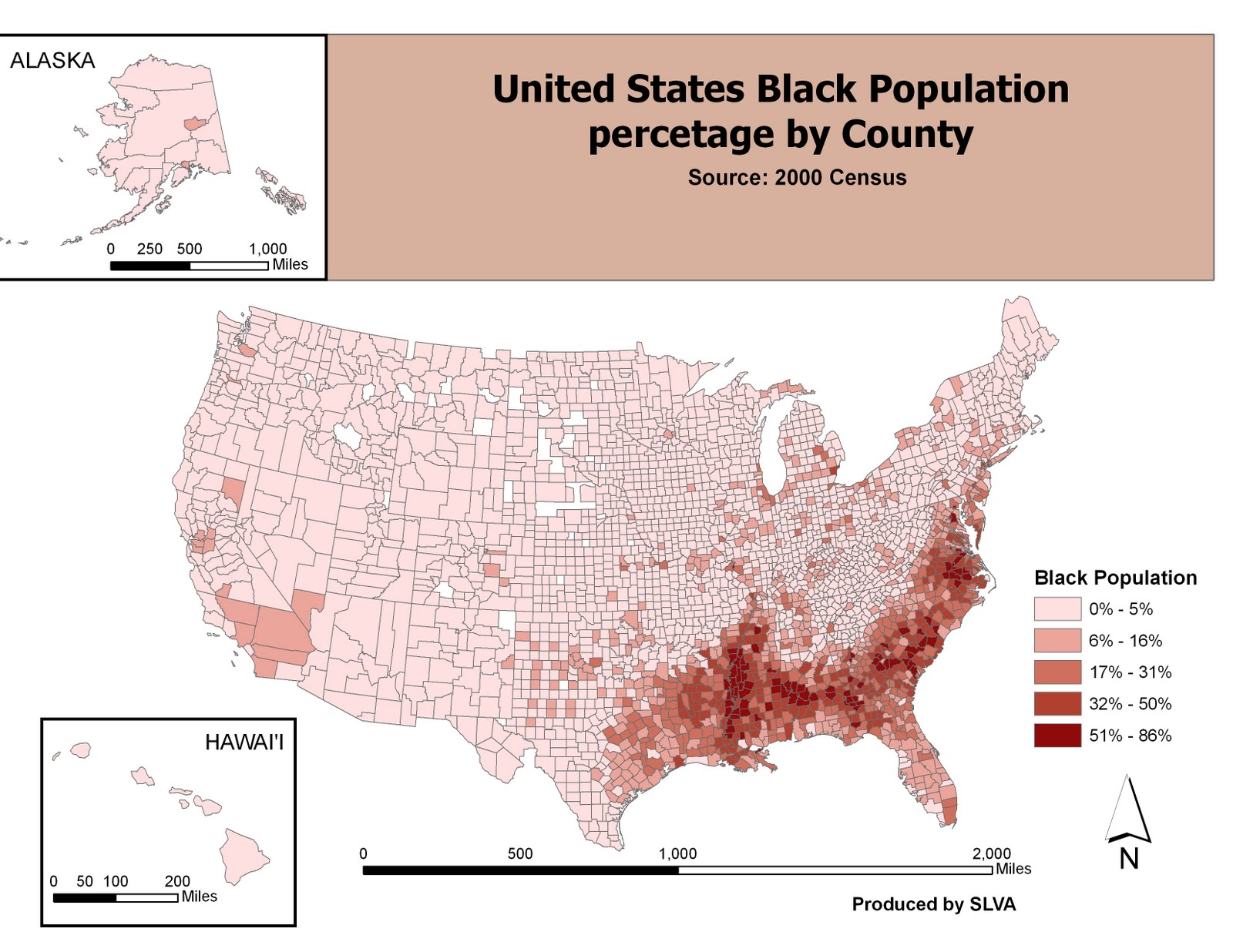
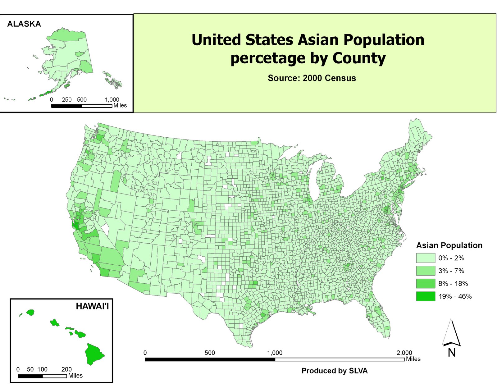
The GIS software can translate the numbers into a visual representation - a map, that people can understand and can interpret what the “numbers” are telling us. The three maps below are a representation of 3 population groups tables (Black, Asian, and Other Race) downloaded from the United States Census website. Each map I will describe and interpret what has been produced. I will also include some of the positives and negatives that arose upon producing each map.
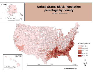
The United States Black population map clearly shows that majority of the Black populations are in the southern states. These include the Virginia, Carolinas, Georgia, Alabama, Louisiana, and Mississippi. The Southeastern part of the state of Texas and the Southern California also has significant black population.
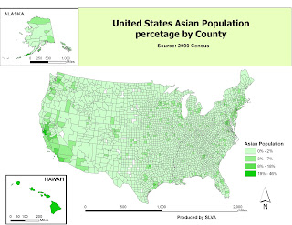
The Second map focusing on the United States Asian population shows a different result. Asian populations on the map are focused more in major cities rather than focused in one region of the nation. Cities such as San Francisco and New York clearly have a large Asian population. The State of Hawaii is the only state that has a large Asian Population within its counties. Additional there are “pockets” of counties that have Asian populations of between 3% to 7% with the proximity of Portland and San Antonio.
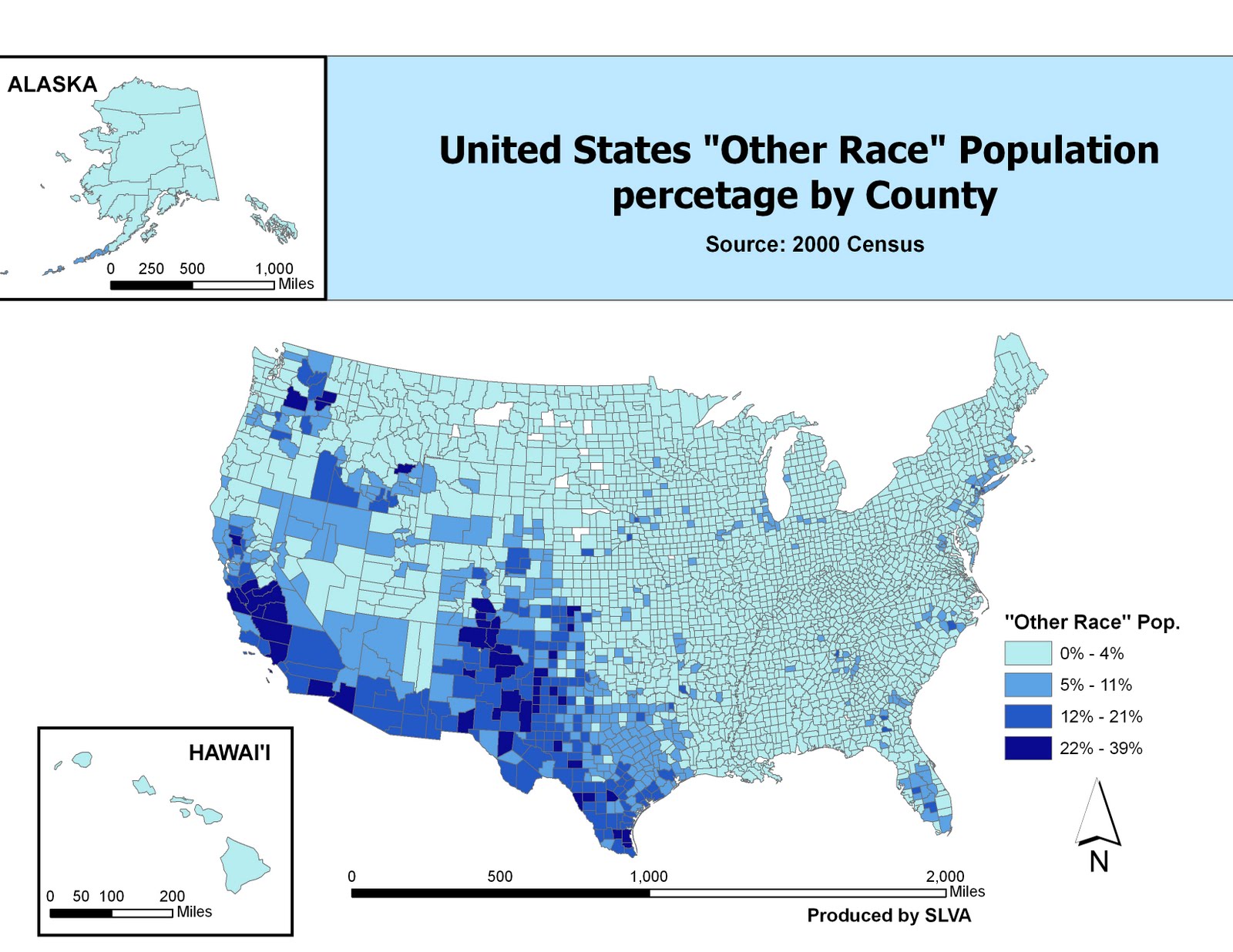
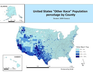
What is titled the United States “Others Races” population map should be retiled to United States Mixed with Hispanic Population. The biggest clue is the focus of the Hispanic populations in the States of California New Mexico Arizona and Texas. Information from the media and internet have shown the increase in population of this ethnic group within these states. What can be concluded is a possibly that the population in this third map of “Other Races” could be the mixing of other races with the Hispanic population which therefore produces a population that is “Mixed with Hispanic blood”.
More analysis would be needed however to verify the data.
Creating these three population maps created some new challenges in working with the GIS software. First retrieving of the Data and modifying it so that the GIS could merge and translate it into a map. The population data from the Census website contained data that was not needed. It became necessary to delete the unwanted data and modifying the headers. What I discovered was the importance of keeping spelling correct or face error results from the GIS when joining the data to the shape file. This did take some trial and error but eventually the results were produced. In addition there are “gaps” in the maps. This may be due to counties that may have no data on the specific race or could be an unincorporated county. The GIS software must be told exactly what to do and must match it to data this is time consuming but must be done for the GIS to work properly. The second challenge in making the map is the integration of the states of Alaska and Hawaii. Problems of setting the data frame with the map, having correct coordinate system, and carefully setting the scales for the additional two maps. The result is a balanced map that shows all the information on different race populations of the fifty states of the United States, which other people can understand and gain knowledge from.

Tuesday, July 13, 2010

July 7 13 Blog


Lab 3 Write Up
Working with the preserved map projections of Conformal, Equidistant and Equal Area, has showed me the importance of knowing and setting the proper map projection when given a GIS project. I will discuss the following 3 topics, first how the map projection differed from each other, second the results (distance from Washington DC to Kabul) concluded from each of the map projections. Lastly the preferred map projection I would use for my GIS usage.
The map projections of Conformal, Equidistant and Equal Area have their own way of projecting the earth. The first map made of the conformal projects of WGS 1984 Web Mercator and World Mercator. Both projections keep the distances at the Equator relatively correct, but “stretch” the polar areas. This is also the same property that my Gall Orthographic Projection (Equal Area Map) and Plate Carree Projection (Equidistant Map Projection) have as well. The Equidistant (Conic) Projection on my equidistant projections map shows a view from the North Pole but has better represents the size and shapes of the Greenland and Russia, which the other projections I made did not. The problem with this projection is the any land mass south of the equator is exaggerated, such as Australia, Africa and Madagascar. The Sinusoidal Projection is the only map projection that does not “stretch” or exaggerate like the other projections. It keeps the land masses proportional and a better representation of the earth’s land mass. The only problem is the poles areas where the projection creates a point and is not rounded.
With the varying differences in each projection came different results of the distant between Washington DC to Kabul. Both the conformal projections had the distant of the two cities at about 10,000 miles. The equal area map projections had the distant of the two cities between 7,200 miles and 8,100 miles, my assumption is that the equal area map projections keeps the distances at these latitudes consistent, unlike the conformal projections. The equal distant map projections had different results the Plate Carree projection distance between DC and Kabul is 10,200miles the most of any projection. Compared to the equidistant (conic) projection of 7,800 miles the lowest of the projections. I equidistant (conic) projection is the most correct due to the projection following true shape of the earth from its northern projection.
With so many different results from the measurement of distances of Washington DC and Kabul. I have to come to the conclusion that each map projection serves a different purpose. The proper projection should be used when needed, for example finding places and distances in the North Pole areas as such with equidistant (conic) projection. The projections each do have some error but it is necessary for them to be used as they are serve as a template for what the earth shape is like. I feel however that projections may become obsolete as GPS has allowed the proper measurement of our earth will eventually be the norm and projection become a thing of the past.