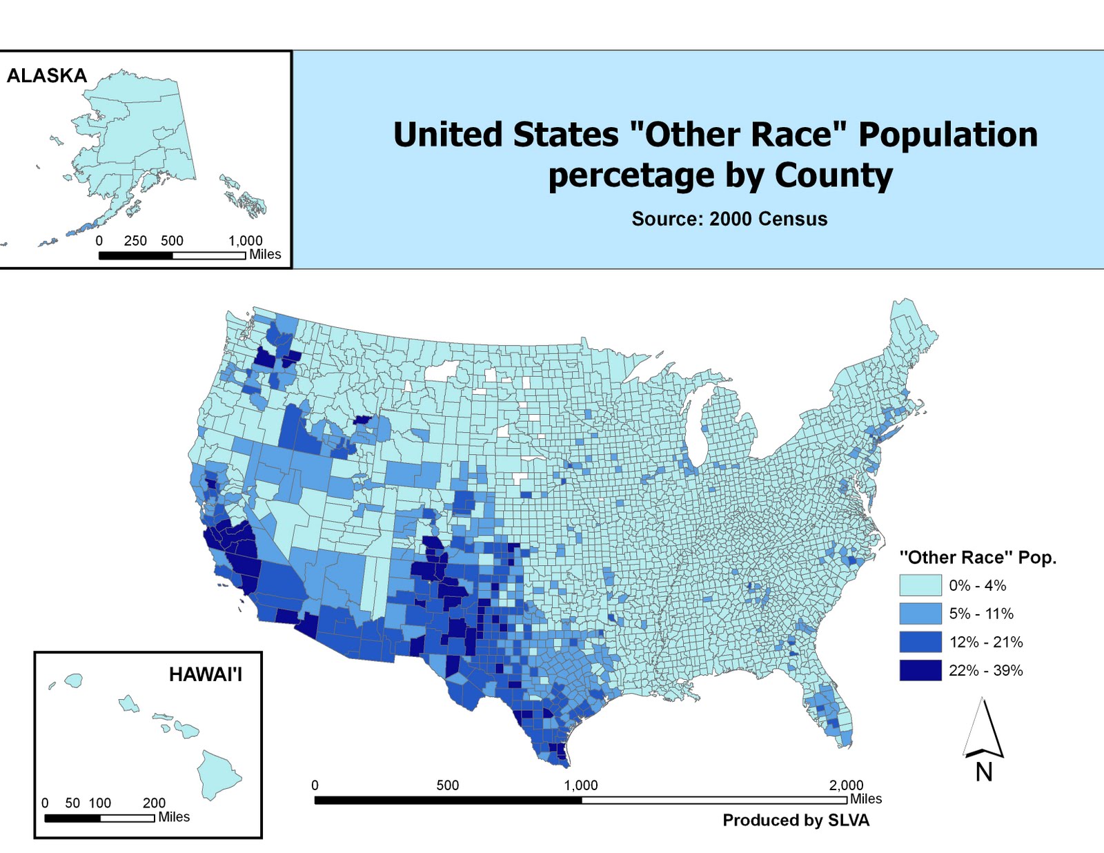
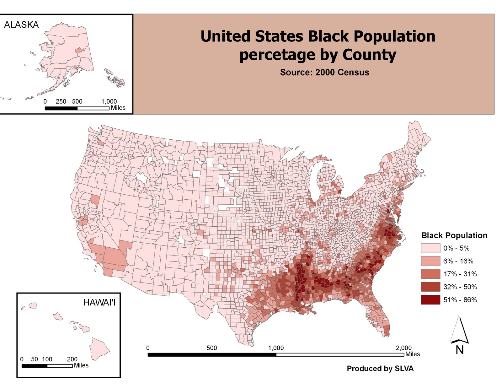
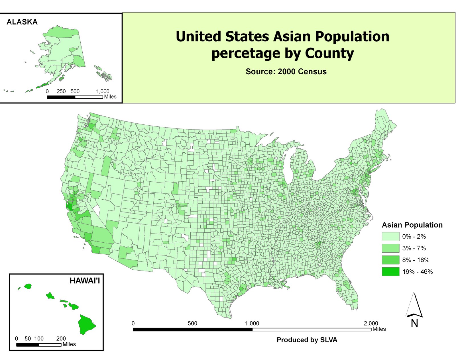
Lab 2a & 2b
Take a look at my map of my Winter Olympic Trip
View Sherwin Aquino Olympic Travel Map in a larger mapLab 2a Write Up
The creating of personal maps which I can share with others through the use of Google my maps is a great communication medium. I am able to share information of a place that others may want learn more about or to visit. Neogeography has great potential however, has pitfalls which can make the information that is shared, not useful or irrelevant. Both the positives and negatives will be discussed below.
The potential for my maps in Google Maps is already in full swing. Many personal maps are shared by many people everyday. From finding the location of the nearest store, to the best scenic bike routes,to virtual tours of places. The variety of maps that can be viewed on Google Maps is enormous. The my map I have made is of my Winter Olympics trip to Vancouver. I have included the places I stayed, the day to day routes that were traveled as well as the integration of pictures that where taken on the trip. In this way I am sharing with others the unique experience of the Olympics. Yet my map is not perfect and has pitfalls that comes with creating a personal map.
The pitfalls of Neogeography is first, errors which includes location errors and naming errors. The second pitfall of neogeography is personal opinion and bias.
The first pitfall of errors of location and names is critical. As a visitor to any new place you do not have the knowledge of the area as local who lives in the area. Therefore as a visitor you make assumptions and pick certain places as “home base” to find your way around. With this however will come a degree of error of where places (such as restaurants and points of interest) really are. The location of a place that has been plotted on a personal map may not be its actually location in reality. For my maps I decided on relative location, by this I have locations of certain places I visited plotted as close proximity to the its actual location. (example Whistler Village Skiing) This was due to the limitation of Google maps saving my map and the difficulty to put the place mark on the exact location. Additionally, my map uses mostly the English names of places within Vancouver and Whistler. The Native Tribes names of various places was not researched and not labeled on my maps.
The Second pitfall, of personal opinion and bias. My maps only show the places I feel where great sites to visit on the trip. The information on sites I have visited may to someone else be considered uninteresting. For example a person may not interested in the location of Aunties house, because they are planning to stay in a hotel. Or a person may not care for the location of the Whistler Ski resort because they a bad experience skiing. Furthermore sites as the Capilano Bridge, may be considered boring to those who are the more adventurous type and may have wanted information on hiking or other activity . The usage of my map by others planning to visit about Vancouver shows information that I know and will may be useful to everyone.
Creating of personal map should come with a well though out process and relaying information to others in a simple yet informative way. The Google Maps my maps is a great tool but in working with this web based application I had some difficulties. The plotting of route lines and how they are plotted can be a difficult task. The “extending” the line feature for example would either make a longer line or would shorten the line into the wrong route on the map. The snap to roads option I found not useful for me because it predetermined (LOCKED to roads) the roads, which were not the roads that was taken on the trip. Saving is an issue as well due to Google saving it on their computers and not on the local computer., which caused a couple errors such as shifting the map and the lines being moved around the map. Beyond these difficulties I believe that anyone can make a personal map to share with anyone, but will always be subject to those who look and interpret the map for there use.
Lab 2B
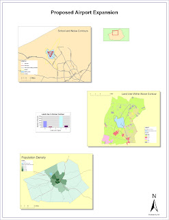
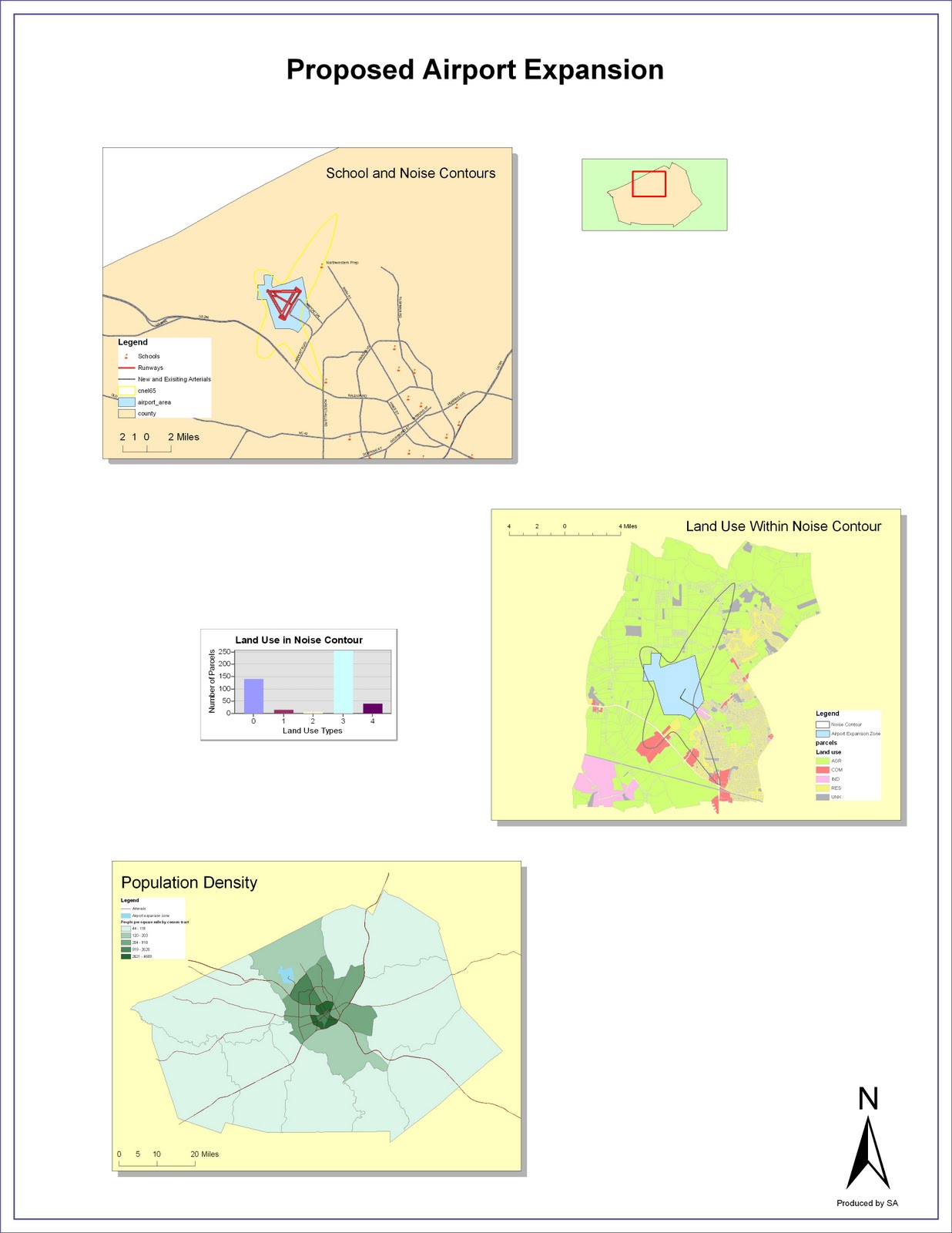
Here is my Proposed Airport Expansion Map
2B Write Up
Enlightening the one word that describes my experience with Arc Map GIS. Working with the Arc MAP on a daily basis at my current job has made me an end user of the GIS map Production. Being able to open a pre made map point and click to items I wish and produce a sewer work order map for my job has made my view of GIS as convenient. Taking this GIS course has given me a new take on ArcMapGIS, showing how powerful the program really is in creating a multitude of maps. I have been enlightened by its ability to integrate more than one map, do calculations and variate presentation. I hope that throughout this course to learn more powerful tools that can be used with Arc Map. I will focus on two items in this blog, the first being what new tools I have learned using the GIS and second the negatives of the program.
Having used the GIS program before, the first part of the lab with basic controls and options was familiar to me. I had no trouble using the interface and understanding the “work flow “ of Arc GIS, in exercise 2 and 3 working with Geographic Features and tables. I have finally learned how the layers, lines, and polygons are made. The instructions given in the tutorial were straight forward and easy to follow. The calculating of population density revealed a tool I did not use previous in the GIS software. Creating the final map required more time but it allowed me to present the airport map that can be used by others.
However the GIS program does have some downfalls, one of the most key is the requirement of the GIS Program to put in all inputs and instruct it what to map. There is no easy wizard that can used to assist the user in creating a map they want to create. Another downfall is the different terminology that must be known ahead of time, such as data frame and extent rectangle. Having heard of the terms allowed me to quickly move in the tutorial but would have made a first time user confused.
Overall my experience with the GIS software has been positive, having worked with it previous at my work. The potential for me to use this software to produce maps in any future work related or academic research will be a skill that will be useful. Yet with the program constantly evolving and updating the need to keep up to date with new features of the program will prevent me from mastering the program to level a feel competent in.
 This is the City & County of Honolulu Department of Planning Interactive GIS maps.
 Been to Waikiki Beach on Oahu lately? Does the beach look a little smaller to you? One place you can find out if the beach is really getting smaller is on the Hawaii Coastal Erosion site hosted by the University of Hawaii School of Ocean and Earth Science Technology. To the left is a map of the Waikiki Beach area and erosion patterns since 1927. It shows how the beach shoreline has changed over the years and pinpoints areas that have dramatic shoreline change. What I like about this map is the historical engineering events that have been undertaken to slow down the erosion. It helps me realize how precious the beach is and how mother nature continues her work. However I find the map to be very "busy" it shows the property lines of various properties in Waikiki which I feel should be removed, additionally increasing the font size of the facts box, would be beneficial due to most people viewing this map on a home computer.
 To the right is a map produced by the Dept of Business Economic Development & Tourism, which shows various land owners on the island of Oahu. What should have been added to this map is a pie chart showing the percentage of ownership. There are a number of private land owners that have more ownership of land than public land owners. This I feel would add perspective to the ownership of land on the island of Oahu. The map legend does feel a bit cluttered with the listing of every land owner. These minor map changes will I believe make the map more practical.
